

I have been following the forums and blogs as much as I had time over these past few years, and today I noticed there is a new video about the upcoming Patch 6 for Zimbra 9 Modern UI (Only for Paid Customers). I will not enter again in the battle of why this new UI is only for paid customers, etc, but I just want to share some feedback as a very long-time Zimbra user, so this is the video about the new changes to the UI, now:
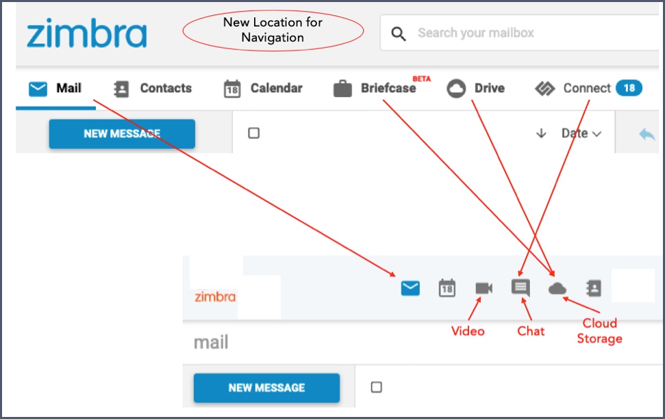
As per the image on the official blog post
A couple of questions:
- Why replace Text and Icon with the only Icon? I consider them good for when in Mobile view, but not in Full Desktop mode. I mean, removing the text might make it even impossible to use for people with certain visual needs. Plus with bigger and bigger screens, how does this UI look in 4K for example? Even 1080p as the recorded video is 1280pixels or less
- What is this new micro-mini Zimbra logo on the left? There you usually replace it with your Company logo, and reducing the size of it I don't think helps anyone.
- Now you removed the Icons from the second bar, and you left the bar completely empty on the most used apps, like Email, Calendar, etc?

- Coming back to the ugly Top Icons. Who had decided the order? I mean, for years, even in other apps, the order is always Mail - Contacts - Calendar. Or at least Mail - Calendar - Contacts. But now is Mail - Calendar - Random stuff - Contacts?
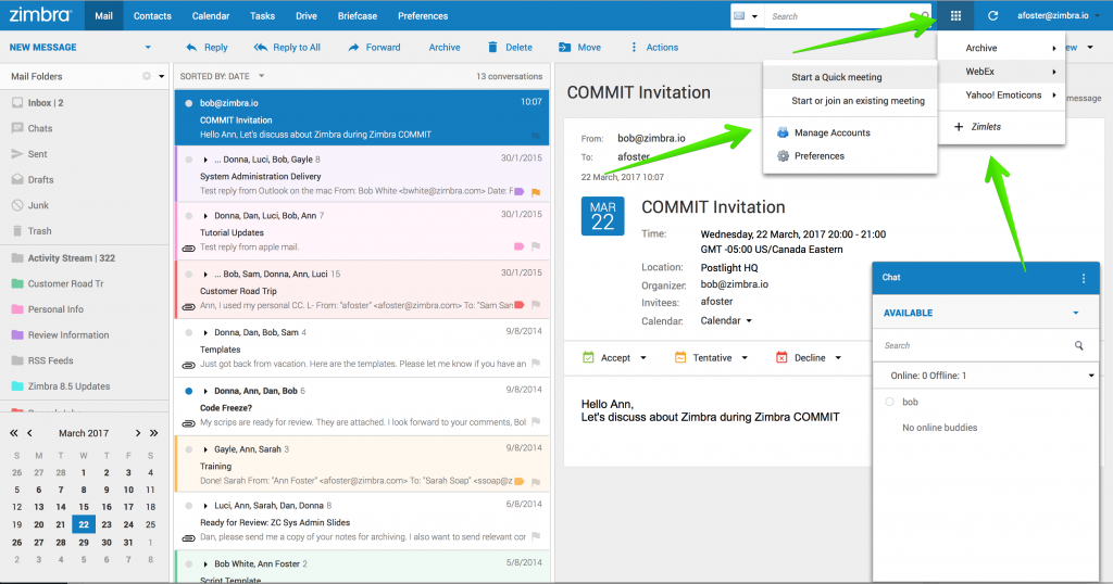
- I appreciate this is old news, but how it can be that an unfinished skin for the "Classic UI" from more than three years ago still looks better, more "Zimbra-taste/feature-rich" than this Modern UI?
Hope this feedback is welcomed to the forum.


